
Opportunity Waves was a company of someone I’ll refer to as Clint the Client. I started with full creative control, and it eventually led to the logo above. But behind every final logo are many other rejected half-formed logos. This is what the development of a logo looks like:

Although I use a drawing tablet for all my design (and all of my computer use, for that matter), it’s still nice to get out the ol’ pencil and paper (and marker), especially for more intricate designs. Running off of the “wave” imagery, this drawing was an aerial view of the final wave at the edge of a beach—the speedy white foam that runs out across shells and beached seaweed and kids’ feet and sand castle moats before pulling back. I thought it would make a nice peaceful image for a benevolent parent company.

I scanned in the initial drawing and recreated it in Illustrator. Even though I put fairly time-intensive work into it and liked how it turned out, it wasn’t clear enough. Sure, it was blue and white, and “Waves” was in the company name, but it wasn’t the most obvious imagery. It almost looks like marbled blue meat. It’s a subject that would make a nice background image, but it didn’t lend itself for two-color logo purposes. Clint the Client agreed, so I tried something else.
My next idea of inspiration were Japanese woodblock paintings of waves, particularly:
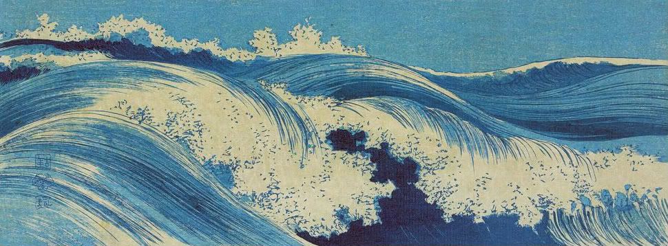
I tried making an Illustrator brush to replicate the waves in these, which progressed as so:


These wouldn’t make good logos, but they catalogue what I was aiming for at this stage. The “O” and “W” designs I would return to later. For now, I needed to stop having fun with brushes and think about making something simple, potentially iconic, and wave-y.

Now they’re starting to look like real logos! The “O” and “W” of the company’s name were made into the sun and sea in the first example, while the others focused on waves. The bottom three were experiments with Illustrator’s warp tools (the left-most one reminds me of sails). For the purpose of a logo, #3 was the winner, and I made variations on it with the company name.

The “W” returns in the final one. To this day, #2 with the tan background remains my favorite incarnation of the Opportunity Waves logo, and I would use it if the company were mine. It was, however, Clint the Client’s company, and Clint the Client wanted a logo that had more of a philosophy and extra meaning behind it. Compromise was necessary.

A ship’s wheel—tradition, antiquity, and it keeps that maritime association with “waves.” A cog—modern, symbolizes steady work and getting things accomplished. It’s a nice pairing, simple, recognizable and potentially iconic, and most importantly, Clint the Client liked it best. So it became the logo of Opportunity Waves. And that’s how it goes!
